10.08.19
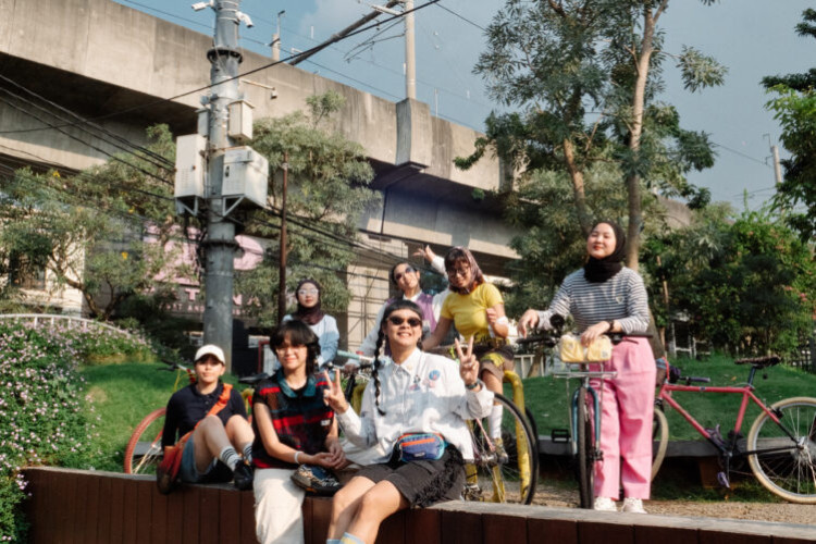
Backstage Life Bareng Grrrl Gang di Episode Kelima Vindy Ngapain?
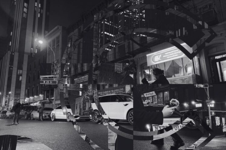
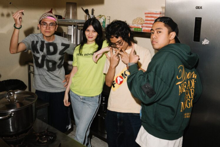
Tahun ini Grrrl Gang mendapatkan kesempatan untuk menjadi salah satu line up di We The Fest 2019, dan Vindy diperbolehkan untuk mengikuti aktivitas mereka.
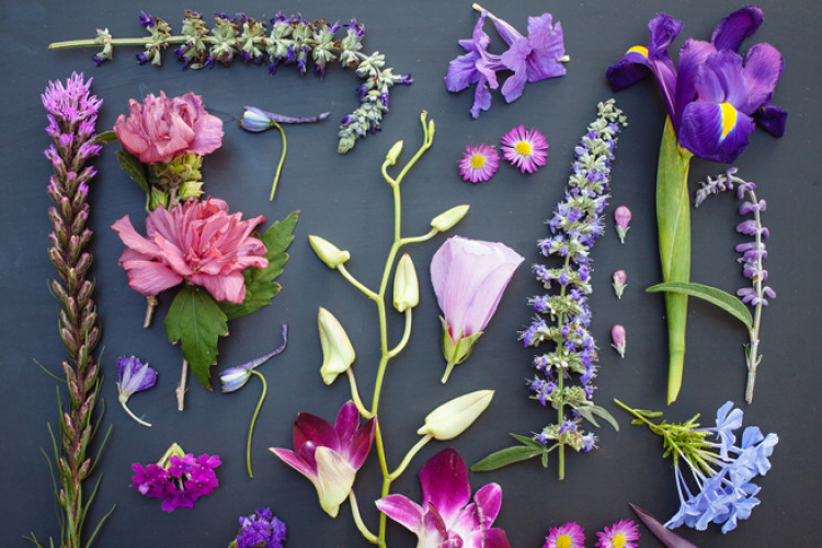


The Garden Collection is an eight-part photography series created by freelance photographer Emily Blincoe. This series was created by using a collection of plants within the same color range above a black surface. The color themes used for this collection are white, orange, pink, red, green, yellow, purple, and brown, where the subjects itself include a variety of plants such as flowers, leaves, and even vegetables. The plants are aligned in a symmetrical order, creating the shape of a rectangle. The overall view of the piece syncs together nicely, making the colors of the plants pop above the black surface. The fact that the plants are well aligned, also make it a more beautiful scene. The position of plants combined with synchronization of colors give a sense of allure that keeps the audience interested. What makes this piece unique is its playfulness with colors and shape. It not only utilizes the mix of colors, but also the size and orders of the plants. Each piece creates its own unique personality that differentiates it from one another, not only from its colors, but also from the way it’s positioned. We can see how the white differs from the purple, where white consists more of big flowers and the purple consists more of small pieces of flowers, or how brown is made of more elongated plants, while pink is made of more wide or round shaped plants. Blincoe maintains a consistency in creating her garden, producing neat arrangements of plants constantly forming a rectangle. How this is done throughout the eight part series makes the whole piece come together nicely. A slight flaw in this piece would be the orange photograph, where it is slightly out of focus, but overall it worked out well. This piece provides a unique concept for the audience and can be categorized as a sight for sore eyes. It is refreshing and cool and would place nicely for anyone that appreciates a good photograph.
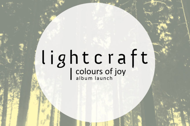
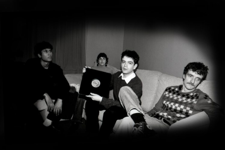
This saturday the 18th Colours of Joy, the sophomore release by Lightcraft, will make its official debut at Kemang's Dia.Lo.Gue Artspace. For those who aren't familiar with the group, Lightcraft is a musical project by 5 Indonesians who met during college in Kuala Lumpur 7 years ago. While crafting their music (no pun intended) in Malaysia, the group experienced some success including having their single "Holding on" reach number 4 Fly FM's Campur Chart. Lightcraft released their first album, Losing Northern Lights, in 2008. The group moved to Jakarta recently, contributing their art to the city's burgeoning independent music scene. Interested in the group's music? If it's a yes, make your way to Dia.Lo.Gue this saturday and check out their music. with performances by: Lightcraft & Tropical Thrust entry:free Colours of Joy CD & Lightcraft Tees will be on Sale. Start: 7 PM Dia.Lo.Gue Jl. Kemang Selatan No. 99A Kemang Jakarta

, a book by award-winning editorial and infographics designer Fransesco Franchi, was released in September 2013. He talks about his vision for the future of the news and media industries. He analyzes the changes that are developing in the digital age and the consumer expectation towards the media. He also provides different solutions and strategies that may be taken by traditional media and design platforms. Franchi’s findings were based on his research for the and other media experts such as Richard Turley from , Daniele Codega from , Steve Duenes from , and many more. He talks about the new ways the media can contribute to the market and how media outlets can become credible news brands. He focuses on the future of editorial designers and how they can contribute to the future of media. Something to look out about is discussions about new age media and digitalization and what can be done to approach the situation. It works the mind and sends off possibilities of what’s to come of our media industry today. An educational and insightful book that takes on different approaches towards the media. It is also designed creatively and consists of eye catching images that make it so much more interesting for the readers. It is definitely a useful book for those working in the media and design industries, and also a thought-provoking book to learn some new information.
Jirapah performed three songs during their performance for the 76th The Weekend Session: Apes, Foxes, and Summer, showcasing a warm, indie rock style. This Jakarta-based band consists of Ken Jenie (Vocals), Mar Galo (Keyboard), Yudhis Tira (Guitars), Januar Kristianto (Drums), and Nico Gozali (Bass), where their original sound started with songs written by lead vocalist Ken Jenie. With the addition of new band members, Jirapah is forming a more diverse sound with more varieties of influences. Jirapah creates a fresh new sound with their peculiar rhythm and arrangements, they also look to experiment more on their sound and it’s definitely something to look forward to. For more information regarding this performance, please visit the link below:
is the second instalment to the first short video of , created by the in collaboration with Channel 4 and Dazed, created and directed by Becky Sloan and Joseph Pelling. If you’ve seen the first Don’t Hug Me I’m Scared video, you’ll know that you’re in for a treat for the second one. This video is pretty much about a seemingly harmless children’s show, only to provide a “special” surprise in the end. What started with a bunch of Muppet characters about to watch their show, soon is disturbed by a new clock form character that wants to explain to them about time in song, the ending turns for the worst when a lot of weird things happen like the characters’ skin peeling off and melting from their bodies. The overall concept of the video itself was interesting in that it includes a different mix of things that doesn’t seem to make sense, which gives a unique experience to the viewers and is definitely something to remember. The imagery is unique as well, creating a whole Muppet experience and providing good animation. However, it gave off a feel of The Simpsons and Family that don’t really make any sense and no story line, but then again, most popular cartoons are like that these days. This is the part of the video that manages to gain a good element of surprise. It definitely catches you off guard by mixing two contrasting elements of innocence and horror and gore. It creates a unique and somewhat disturbing blend, leaving a disturbed feeling of having seen somebody being mutilated right in front of you. Having seen the first Don’t Hug Me I’m Scared though, it ruins the surprise at the end because I knew what to expect and it really wasn’t as creepy or interesting as the first. As a sequel, I feel they could have done much better.

is a photographic series by Chino Otsuka a London-based Japanese photographer. This series revolves around the childhood of the photographer and her past memories. The photographs were formed by taking Otsuka’s childhood photographs and inserting her adult self in them, creating a sense of travelling back in time. Otsuka used some photographs from her teenage year as well – inserting them with her photographs from the year 2005 to 2009. The photographs were taken in different places, showcasing her many experiences travelling the world. Otsuka portrayed her photographs with great subtlety making it seem that her photos are one with the other. She handles the photos with precise details, creating a smooth and clear image, making it impossible to tell any signs of photos hoped work – something I would never have known if it weren’t pointed out to me. Some examples of this technique can be seen from some of her photographs like her photo in Japan with the , which presents a slightly blurry surface, which she manages to imitate, also other images like of her in Spain, which replicates the colors and grains to the exact. Her photographic technique shows her creativity in handling the photographs creating a natural look for it. What makes this series interesting is the sense that Otsuka actually went back in time and took a photograph with her younger self. She did a very good job in creating that essence and making the experience real for the viewers. This simple yet well-created piece takes you to the past to catch a first-hand glimpse of Otsuka’s childhood. The whole series falls together nicely – each photograph having its unique theme, but always with one similarity: all including two Otsukas. It not only allows us to view into her past but also gives us a unique concept to the possibilities of time travelling. It allows your imaginations to come to life.
Tahun ini Grrrl Gang mendapatkan kesempatan untuk menjadi salah satu line up di We The Fest 2019, dan Vindy diperbolehkan untuk mengikuti aktivitas mereka.
Temukan siapa dirimu dan bagaimana karaktermu menentukan arah masa depan.